Accordion
UI ComponentsA vertically stacked list of headers that can be clicked to reveal or hide associated content panels, useful for organizing large amounts of content.
Visual Examples
How It Works in Apps/Websites
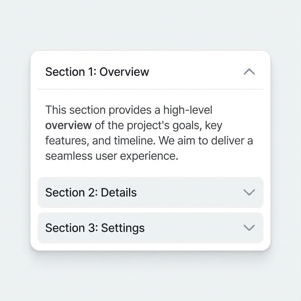
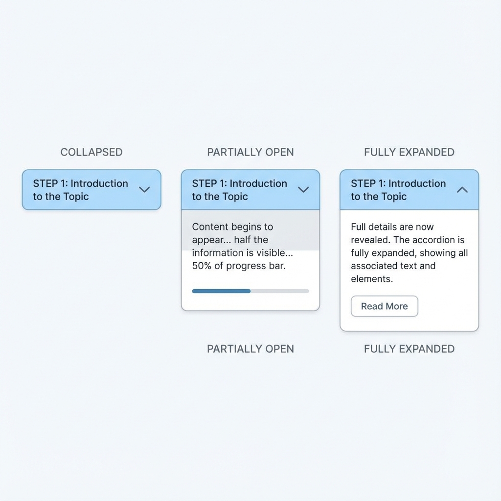
Accordions save vertical space by hiding content until needed. Each section has a header (clickable) and a panel (expandable). Clicking a header toggles its panel. Accordions can allow multiple panels open simultaneously or exclusive mode where opening one closes others. Common for FAQs, menus, and settings.
How AI Interprets This Term
When you say 'accordion', AI expects: stacked horizontal sections with clickable header bars, each containing title text and expand/collapse icon (chevron or plus/minus). Expanded panels slide down smoothly revealing content. Collapsed state shows only headers.
Prompt Examples
Copy-paste these prompts to use in your AI tools.
Create an FAQ accordion with 5 questions and answers
Design an accordion component: headers with left-aligned text and right-aligned chevron icon that rotates 180deg when expanded. Subtle border between items, smooth 300ms slide animation for content. Allow multiple sections open.
Show an accordion (vertical expand/collapse) vs tabs (horizontal content switching) for the same FAQ content
Compare With
Related or contrasting terms to help you understand the differences.
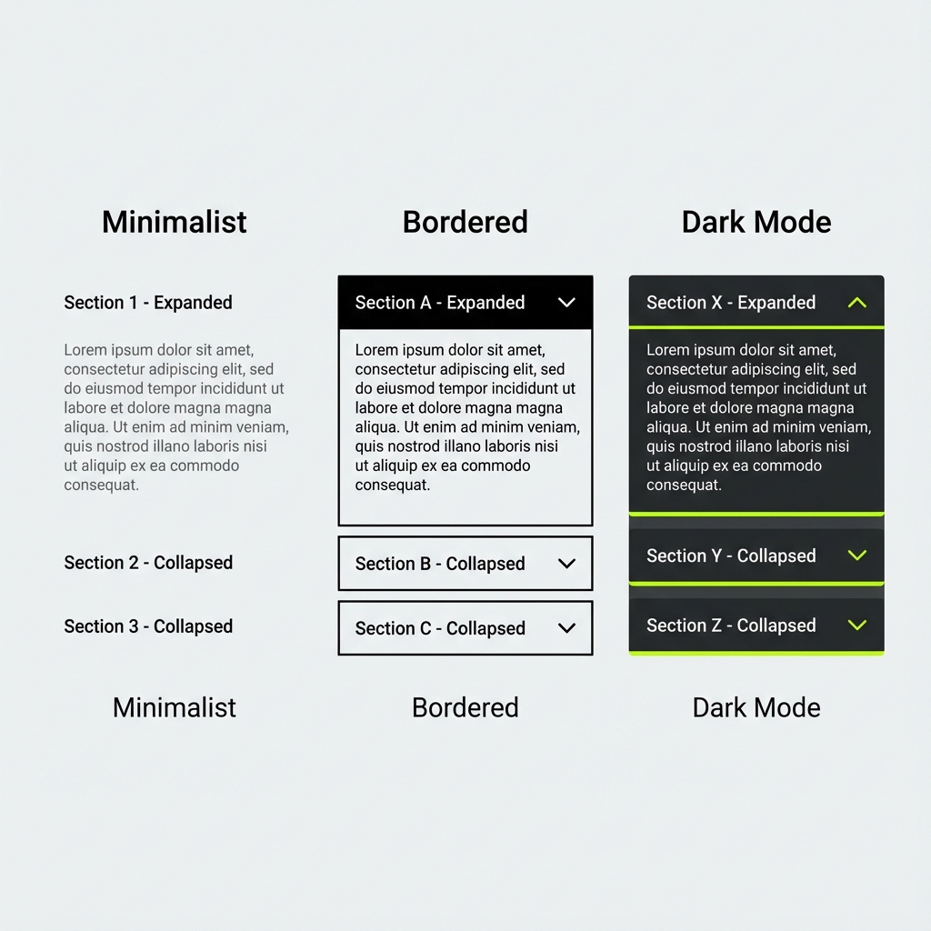
Variants & States
Variants
States
Usage Guidelines
When to Use
- •FAQ sections
- •Complex forms with sections
- •Mobile navigation menus
- •Settings and preferences
When NOT to Use
- •Small amounts of content
- •Content users need to compare
- •Critical information that must be visible