Primary Button
UI ComponentsThe main action button on a page, designed to draw attention and guide users toward the most important action.
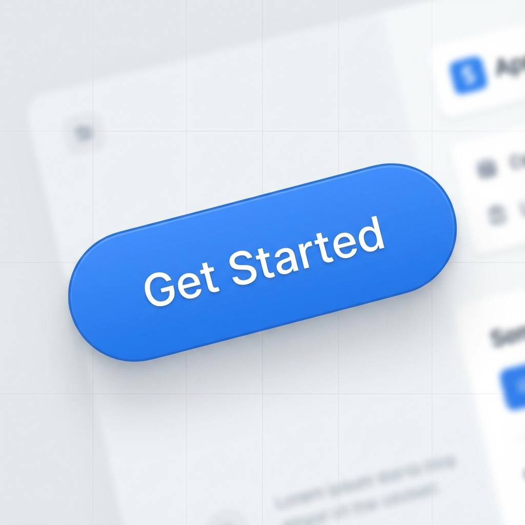
Visual Examples
How It Works in Apps/Websites
The primary button is the most important action element on any screen. It uses the brand's primary color and stands out visually from all other buttons. Designers use it to guide users toward the main action, create visual hierarchy in forms, and signal 'this is what you should do next.' You'll find primary buttons in signup forms, checkout flows, modal confirmations, and CTAs.
How AI Interprets This Term
When you say 'primary button', AI understands this as the most visually prominent button with the brand's main color (usually blue, green, or purple), higher contrast, filled background, and often centered or right-aligned positioning. It will typically be larger or more emphasized than other buttons on the page.
Prompt Examples
Copy-paste these prompts to use in your AI tools.
Create a signup form with a primary button labeled 'Get Started'
Design a card with a primary button (large, rounded corners, brand blue #3B82F6) aligned to the right with a right arrow icon
Show a form with a primary 'Submit' button and a secondary 'Cancel' button side by side, with the primary button on the right
Compare With
Related or contrasting terms to help you understand the differences.
Variants & States
Variants
States
Usage Guidelines
When to Use
- •There's only one key action on the page
- •The user must complete a critical step
- •You want to guide attention to the most important action
- •In form submissions (Submit, Save, Continue)
- •For CTAs that drive conversions
When NOT to Use
- •Multiple equally important actions exist on the same page
- •Inside a dense form with many fields and actions
- •When the action is destructive (use a destructive button instead)
- •For navigation or secondary actions
Related Terms
CTA (Call-to-Action)
A prompt that encourages users to take a specific action, typically presented as a button or link with action-oriented text like 'Sign Up', 'Buy Now', or 'Learn More'.
Hover State
The visual appearance of an interactive element when a user's cursor is positioned over it, indicating that the element is clickable or interactive.
Loading State
The visual appearance of an element or page while content is being fetched or a process is running, indicating to users that the system is working.
Secondary Button
A button style used for secondary or alternative actions, visually less prominent than primary buttons, typically featuring an outline or subtle background.